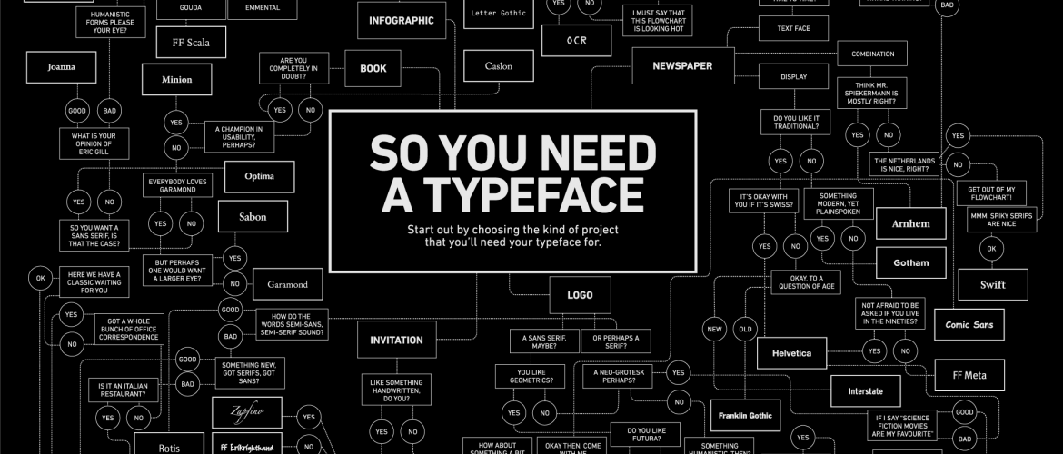
With so many fonts and typeface options available, and new ones popping up on a daily basis, it can be tricky to choose the right one for your web design. There are several factors you should be taking into account, including readability, personality and design intent.
Here are a few useful tips to help you find the right typeface for your next project.
Keep a List
If there’s one thing every designer should have, it’s a running list of fonts you can use for future projects. Anytime you come across a font you like, simply add it to your list and you can always revisit it when it’s time for your next project.
Group your fonts into different categories, such as urban fonts and classic fonts, so you can easily find the right one when the time comes. Having an organized list handy will make the job that much quicker and simpler, so you can choose the right typeface without wasting time.
Consider Your Goal
It can be tempting to choose a typeface merely based on the beauty of the design, but you need to think of things in practical terms. The first thing you should be considering is your goal, as this will help to guide you through the decision making process.
When users read the text, what are they trying to achieve? Are they trying to learn more about a product, browse through some entertaining stories, or are they doing a bit of online shopping? Think about how you want your audience to react to the text and this will help you focus on the factors that matter most.

Think of Tone and Message
The next factor to consider is the tone and messaging of the project. You will want to ensure that the typeface matches this, so ask yourself a few questions along the way:
- Is the project casual or formal?
- What mood am I trying to evoke?
- How will the typeface pair with images or color?
- Will it be used for small or large text?
- Does the personality of the typeface match the intended emotional response?
By stopping to ask yourself relevant questions along the way, you can help to ensure that you stay on the right track with your web design.
Keep it Simple
The one thing you should be aiming for is readability for all in order to avoid building accessibility barriers. This refers to the ease with which words, sentences and paragraphs are read. In most cases, you will be aiming for ease of communication before style.
Readability is about much more than selecting the right font. While some typefaces are designed to be readable, you still need to make sure you use them in the right way. Avoid too many typefaces on one page, tiny font sizes, crammed line-length and moving text.
Remember to consider different platforms when choosing things like line length for a website. On a desktop, you should aim for a line length of 50-75 characters, whereas for a mobile you should be going for 30-40 characters. Always consider your end users when considering best readability and choosing your typeface.


Comments are closed.